Friday, 15 April 2016
Friday, 8 April 2016
Tuesday, 5 April 2016
Chosen Location
We originally chose a large, antique-like house in Hellesdon due to the aesthetically pleasing attributes that it possesses such as the grand size. Unfortunately, our first shoot in this house went pretty awful, so we decided it was best to choose a different location that was much more suitable. The second house - a house that belonged to one of our group members in Mulbarton - was easier to access and more convenient for everyone to get to.
Although the Mulbarton house was a little smaller than the Hellesdon house, it was still just as suitable, and the easy access allowed us to film much more efficiently in the time frame we had. The Mulbarton house was actually a lot better in a few ways compared to the Hellesdon house; for one, it had a stone path leading up to the house which had a much better impact on our sound. The sound of the footsteps on the stones is much more effective, and a key part of our thriller. Furthermore, the new choice of house had a larger bedroom than that of the Hellesdon house, which enabled us to fit the tripod more comfortably in the room, and allow us to achieve the best shots possible. The bed in the Mulbarton house had a lot of room underneath where we could place the bag, which is an important part of our thriller. The new house actually fit our storyboard better, especially because of the bedroom. This was a relief as we didn't have to redraw our storyboard. Below are some practice shots that we thought would help us get a feel of what angles and places to use when we film.
 |
| Mulbarton House |
 |
| Practice Shot 2 |
 |
| Practice Shot 3 (Final Shot) |
 |
| Practice Shot 1 |
 |
| Practice Shot 3 |
Sunday, 3 April 2016
Q2. How does your thriller opening represent gender?
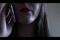 For our thriller, we didn't want to follow generic conventions of most thriller movies, where women
 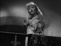 are shown as inferior and less powerful to men. We wanted to have our female protagonist as the character with more power, therefore challenging the genre. Our inspiration for doing this was the film "Double Indemnity" where the main female character outsmarts the male protagonist, showing that she is more powerful than him. 'Double Indemnity' also inspired the femme fatale aspect of our
  thriller opening. We enforced Serena's power from the beginning by using a low angle shot whilst she's on the phone, whereas when Mr Mordecai is being introduced for the first time, there is a very high angle shot used which makes him appear vulnerable and of less power than Serena.
 Serena is shown as feminine the way that she's clad in a red dress and heels, but also in the way that she's putting her lipstick on at the beginning. However, the femme fatale aspect is shown clearly here as she's using a knife as a mirror, showing that she is dangerous, but also glamorous. Another prop we used to display Serena's sininster, deadly personality was a gun. At the end of the thriller opening, a gunshot is heard which the audience can be sure that it's from Serena shooting Mr Mordecai. The gun is a physical representation/symbol of Serena herself; although small, she in in fact incredibly deadly.
 We presented our male character to be intelligent, as shown by being dressed in a suit and carrying the right tools to be able to enter the house. This is inspired by the film noir thriller 'The Third Man' and a more modern thriller 'Se7en'. In the opening sequence of 'Se7en', we are shown the morning routine of detective Somerset. Part of his routine is making sure his suit is clear of any dust; the suit is what inspired what our male protagonist would be wearing. Holly Martins and Harry Lime in 'The Third Man' are also dressed smartly, and throughout the film Harry is able to outsmart many people, the way he's dressed enforces his intelligence. Also, Holly must be intelligent too as he was eventually able to find out where Harry was.
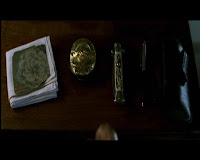 Detective Somerset in 'Se7en' has all of the things he needs laid out and ready to pick up and use, which inspired us to give Mr Mordecai a lockpick, showing that he's intelligent and prepared. Something that furthers the idea that Mr Mordecai is intelligent is that he pretty much knew straight away where the bag would be.
 Women in our thriller task are presented as deceitful and secretive. We achieve this representation by never showing the whole of Serena's face, and never showing the whole of Serena's body in any one shot. The idea of deceit of the woman to the man in again inspired by 'Double Indemnity'. I thought that this still from 'Double Indemnity' best replicates what we were trying to achieve in our own thriller; this scene is supposed to seem like a face off to when the two meet. The male character in both are less out of focus than the female characters who both dominate the frame, making the women seem more superior.
Friday, 1 April 2016
Q1. In what ways does your media product use, develop or challenge forms and conventions of real media products?
Our thriller is an inspired by the film noir aspect of thriller films. In our thriller opening, we use and challenge conventions of the film noir genre. Most of our inspiration came from 'Double Indemnity' as even the plot is like ours - the female character deceives the male character.
Costume
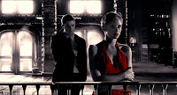
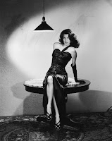
 For the costumes of our characters, we wanted both of them to come across as sophisticated and professional, so we dressed Mr Mordecai in a suit, and Serena in a nice red dress. Serena's costume was inspired by 'Sin City', where the woman in the opening scene is wearing a bright red dress, making her appear glamorous. Red is a colour often associated with seduction, passion but also holds connotations of danger. These connotations perfectly fit into Serena's personality, and the idea of femme fatale that is quite evident in our film. The shoes Serena is wearing are inspired by a 1946 film noir film called 'The Killers'. We chose these shoes as they are quite high and have a thickness to them which just screams "dominant". The height of the shoes represent how Serena has more power over Mr Mordecai, and with the shot that they're closely shown in, Mr Mordecai is also in the shot where he appears powerless and vulnerable.
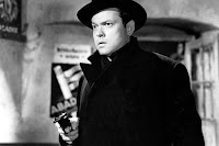 For our male character, we found inspiration for his costume from Harry Lime in 'The Third Man'. Throughout 'The Third Man', Harry Lime is a mysterious, secretive character spends most of his time in the film trying to escape from people a deceiving them, Although we couldn't find a large black trench coat like the one Harry is wearing, we came close with a black suit. Furthermore, something we did get right was the hat Harry is wearing. We wanted to portray Mr Mordecai as being a very intelligent, sophisticated man in what he wears, so the suit was a perfect way we could do this and still fit into film noir conventions.
Props
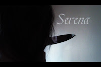
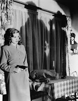
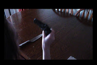 This is the area in which we felt we could use to best challenge traditional film noir conventions. Most commonly in film noir, women are portrayed as 'damsels in distress' and inferior, which is what we wanted to challenge specifically. One way we challenged traditional conventions is by giving Serena not one, but two weapons; the knife and the gun. Although the knife was never used and the gun was, Serena still has it in her possession. One film we found that also challenged is a 1947 film noir style film called 'Out of the Past', where a woman is shown to be behind the gun for once. (Shown below to the right)
Because we wanted to challenge film noir conventions, we displayed Serena as being powerful and dangerous, as well as secretive and mysterious; we aimed to present her as being more dominant over the male character - Mr Mordecai.
 The gun Serena possesses is very small and delicate, yet lethal and dangerous which is a perfect representation of her personality.
Location
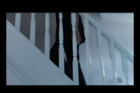 'Double indemnity' also inspired our location. We needed a house with stairs which had banisters with gaps between like in Double Indemnity. The reason we need this shot is we needed something to have connotations of prison; stair banisters are perfect for this as they look like jail cell bars. We needed this because it shows that Serena and Mr Mordecai are involved in dangerous, criminal activity which could lead to them ending up in prison (Serena especially as she murders Mr Mordecai). The connotations to a jail cell also create a claustrophobic, trapped feeling, adding to the tension and intensity of the situation. This idea of entrapment is inspired by 'The Third Man' when Harry Lime is trying desperately to find a way out of the sewers.
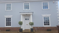 We filmed at a large house which looks very grand as it has pillars. We needed to film at a location like this as it makes more sense to have Mr Mordecai stealing from a wealthy person. Plus this suits the genre as most film noir films are glamorous and grand. We required a large house as we needed to show the extent to Mr Mordecai's skill in breaking into big, expensive houses. The bag he steals is our MacGuffin, as we never find out what's in the bag, which corresponds to how we do not yet know why Serena killed Mr Mordecai.
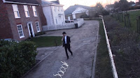
 Similar to 'Essex Boys', our location choice has quite bleak colours and scenery, which we needed to have to represent hopelessness of Mr Mordecai's future. A certain scene from 'Essex Boys' inspired our opening scene shots, however ours doesn't have a vanishing point which would've been ideal to outline Mordecai's death and how he would come to an end. We changed the saturation in editing to be similar to the one in Essex Boys as we wanted to show bleakness. We found it difficult to directly replicate the locations found in most film noir thrillers, but the house we did film at was probably as close as we could've gotten.
Sound
Our original soundtrack idea was to have soft jazz playing in the background, similar to the 'Sin City' opening scene soundtrack but unfortunately, we were unable to find such soundtrack due to Copyright issues. Instead to build tension and uneasiness, we found a low rumble, which can be heard throughout the opening of our thriller, along with a soft drum beat to build tension. Although we wanted to develop film noir conventions here, our version with the rumble still worked just as effectively as a jazz soundtrack would've.
To correspond to Serena's mysterious, unpredictable nature, we used non-diegetic wind chimes to create an eerie, uneasy feeling. This creates the feel of uncertainty around Serena, with the audience unsure of her next move. The audience may even believe that Serena is mentally unstable, and the wind chimes that challenge the film noir genre may lead them to believe that she is morally evil.
To correspond to Serena's mysterious, unpredictable nature, we used non-diegetic wind chimes to create an eerie, uneasy feeling. This creates the feel of uncertainty around Serena, with the audience unsure of her next move. The audience may even believe that Serena is mentally unstable, and the wind chimes that challenge the film noir genre may lead them to believe that she is morally evil.
We used diegetic sounds such as the phone beep, footsteps on the gravel and the gunshot where the original sounds we had were not loud enough, apart from the gunshot as we didn't already have a sound for this.
Camerawork
Camerawork
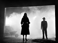 Many shots seen in our thriller are widely influenced by other film noir thrillers.
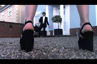 The face-off scene between Serena and Mordecai is inspired by this shot from 'Double Indemnity', we added our own touch to it but its still, if not more effective.
 This shot from 'Se7en' inspired us to use the same technique as we wanted Serena to come across as organised, neat and very prepared.
Monday, 28 March 2016
Thursday, 24 March 2016
Monday, 7 March 2016
Wednesday, 24 February 2016
Choosing Fonts
Title
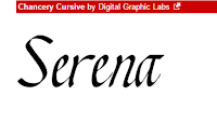
For the title, we found five different fonts which we could use for our film title. Font A to the right is a very simple font and is bold enough not to have any of the letters get lost into the background, which happens with thin fonts. The downside of this font is that it is too simple and uninteresting and isn't very exciting, which if used would make people think our thriller opening boring and lack excitement.
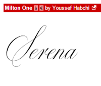
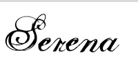
Font B to the left has a lot more character than font A. This font is much more suited to our thriller, as one of our main characters is a woman who is seen as very elegant and well-presented, which is exactly what this font portrays. However, unlike font A, font B is not bold enough and would easily be lost in editing due to its thin letters, and the effect of this font would be under-appreciated.
This font is quite bold and has very prominent and curly serifs. This font a quite overwhelming and over-powering. I don't think that this font would be the best one to use as it's too curly and doesn't really fit the theme of our thriller as much as the other fonts we have found
Font D is very elegant due to the type of serif used on each letter. The benefit of this font is that it's not too thin, meaning it wont get lost in editing and you'd be able to see all of the font still. This font suits the main character - Serena - because the font is elegant and sophisticated, just like how Serena is. The audience will quickly figure out Serena's qualities just from seeing this font.
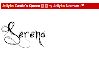
Font E has serifs, however these serifs are sharp and scratched, which defeats the fact that Serena is elegant and sophisticated - this font is scruffy and is more suited to the horror genre rather than the genre of our thriller film.
Credits and Names
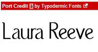
Font F is a very clear font where you can easily read the words. Also this font is quite bold so it wouldn't get lost during editing, making it a good choice of font. As well as this, it has Film Noir font conventions.
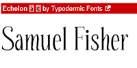
Font G is a font which is quite pleasing to the eye - it's easy to read but it's not boring, it has slight serifs making it interesting and is quite formal. This font is also good because it has a sense of formality which is a key part of Film Noir conventions.
Font H is quite bold which is good because this means it would be easy to use in our thriller opening as none of the letters would be lost during the editing process. This font has features of a Film Noir font due to it's neat, simple qualities.
Font I is an uninteresting font due to the lack of serifs, or anything to make it even slightly unique or exciting. This font is simply average and is not a good choice for our thriller opening due to the absence of any Film Noir font conventions.
Production Company Name
 This font is the only font we found to use for our production company name, we didn't look for any more after we found this font because the whole group agreed that this font was perfect to use as our production company name font. This font is very interesting due to the serifs on the start and end letters. The font is easy to read and fairly bold, despite the thin lines of the serifs which may get lost in editing, however we didn't think this would be too much of a problem because the main body of the letters are still fairly bold. Our chosen production company name is this font as it is very pleasing to the eye and is also quite interesting.
 |
| Font A |
 |
| Font B |
Font B to the left has a lot more character than font A. This font is much more suited to our thriller, as one of our main characters is a woman who is seen as very elegant and well-presented, which is exactly what this font portrays. However, unlike font A, font B is not bold enough and would easily be lost in editing due to its thin letters, and the effect of this font would be under-appreciated.
 |
| Font C |
This font is quite bold and has very prominent and curly serifs. This font a quite overwhelming and over-powering. I don't think that this font would be the best one to use as it's too curly and doesn't really fit the theme of our thriller as much as the other fonts we have found
 |
| Font D |
Font D is very elegant due to the type of serif used on each letter. The benefit of this font is that it's not too thin, meaning it wont get lost in editing and you'd be able to see all of the font still. This font suits the main character - Serena - because the font is elegant and sophisticated, just like how Serena is. The audience will quickly figure out Serena's qualities just from seeing this font.
 |
| Font E |
Credits and Names
 |
| Font F |
Font F is a very clear font where you can easily read the words. Also this font is quite bold so it wouldn't get lost during editing, making it a good choice of font. As well as this, it has Film Noir font conventions.
 |
| Font G |
 |
| Font H |
Font H is quite bold which is good because this means it would be easy to use in our thriller opening as none of the letters would be lost during the editing process. This font has features of a Film Noir font due to it's neat, simple qualities.
 |
| Font I |
Production Company Name
 This font is the only font we found to use for our production company name, we didn't look for any more after we found this font because the whole group agreed that this font was perfect to use as our production company name font. This font is very interesting due to the serifs on the start and end letters. The font is easy to read and fairly bold, despite the thin lines of the serifs which may get lost in editing, however we didn't think this would be too much of a problem because the main body of the letters are still fairly bold. Our chosen production company name is this font as it is very pleasing to the eye and is also quite interesting.
Thursday, 21 January 2016
Pitch/Treatment
Darkness seeps across the concrete slabs. Blunt thuds creep down the alley into the shadows. The night shrouds an unknown man, adorning a trench coat that cascades down from his shoulders. He is on the phone to a petite woman, delicately putting blood-red lipstick on her soft lips.
"Now do me a favour. Mordecai; fetch me that bag and don't get caught" she purred.
Mr. Mordecai gave a grunt and put his phone away. Precarious and cautious, the man slithered towards the monolithic house's door, unsheathing a sword-like lock pick. With a few twists and jolts, he got in. Mordecai crawled around the house and located the bag in minutes. He recovered the bag and slipped out the house like a ghost. Bright lights caught Mordecai in a daze. Slinking out of the shadows, a beautiful woman materialised. A slit of red made a tiny chuckle.
"Miss Jezebel, what should we do?" a gruff voice growled from behind the rays of the car light. Smooth Miles-Davis like jazz plays.
Influenced by "L.A Noir" and "Double Indemnity", the opening uses low-key lighting to establish characters as sinful, morally ambiguous and dangerous characters who don't follow the social norm. The costumes have been heavily influenced by the colours used in "Sin City". For example, we are planning on using a similar costume the female wore in the opening as it is red which is a seductive and powerful colour. Our location has been influenced by "The Third Man" as the house we are planning to film at is an old house with a barred staircase in order to show German Expressionism.
Influenced by "L.A Noir" and "Double Indemnity", the opening uses low-key lighting to establish characters as sinful, morally ambiguous and dangerous characters who don't follow the social norm. The costumes have been heavily influenced by the colours used in "Sin City". For example, we are planning on using a similar costume the female wore in the opening as it is red which is a seductive and powerful colour. Our location has been influenced by "The Third Man" as the house we are planning to film at is an old house with a barred staircase in order to show German Expressionism.
Wednesday, 20 January 2016
Character Planning
Main Character (1) - Mr Mordecai
Personality:
Personality:
- Nationality: English
- Age: 28
- Aspects: Determined, headstrong, brave, morally ambiguous
- Gangster.
Costume:
- Black/dull colours
- Big black coat
- Fedora
Possessions:
- Lockpick
- Phone
- Bag
He is inspired by characters from Casino Royale and La Noir.
Main Character (2) - Serena
Personality:
- Nationality: English
- Age: 18-25
- Aspects: Dangerous, seductive (femme fatale), manipulative, intelligent, strong
Costume:
- Well-dressed
- Dress/skirt
- Big heels/ heel boots
Possessions:
- Knife
- Phone
Extras - Henchmen x2
Personality:
- Nationality: English
- Age: 18-25
- Aspects: Strong, not that intelligent, quiet
Costume:
- Long black coats
- Black trousers
Possessions:
- Guns
- Knives
- Bag
Monday, 4 January 2016
Essex Boys [Unfinished]
Analysis of Stills
This shot uses a strong key light and backlight. The effect of this is that is makes us as the audience believe that this character has a significant and important role in this film. Furthermore, this shot's light is used in such way which lights up half of his face and keeps the rest in darkness, which leads us to think that this character has a good side and a bad side. As well as this, the character dominates the whole frame as he is the only thing we can see, this shows again that he is an important character and is also a very dominant one.
Again in the shot to the right, this character dominates the whole shot and is standing in a superior stance, which makes clear of his status to the audience. Moreover, another thing which establishes his status is the low angle shot looking up at him, as we see from the other character's eyes. The perspective of the other character - Billy - we see through his eyes that the windscreen of the car is very dirty which shows that Billy has a clouded view of the character before him. This could represent how Billy doesn't know what he's getting himself into as he doesn't know what Jason is really like; his vision of him is clouded.
The significance of the tunnel's lights reflecting onto the car windscreen could foreshadow how both characters could eventually end up in prison due to what they do throughout the film. This still from the film also links to another still which could also foreshadow that prison may be in the cards for them later on in the film.
Before they enter the tunnel, we see this shot. This shot lets us us see down the tunnel which we can see is dark towards the end; this darkness could represent how these 2 characters are heading into something dangerous and unknown. Furthermore, the tunnel is lit by lights along the top which look like prison bars, again foreshadowing that prison might be where they end up at the end of their journey.

This shot is very bleak and empty which could be representative of the lives the people in seen in this film. As well as this, the vanishing point in this shot emphasises the thought of these people's lives being bleak and empty as it could show that this bleakness is never ending and they're never going to escape it. The dull colour palette used in this shot further emphasises
The significance of the tunnel's lights reflecting onto the car windscreen could foreshadow how both characters could eventually end up in prison due to what they do throughout the film. This still from the film also links to another still which could also foreshadow that prison may be in the cards for them later on in the film.
Before they enter the tunnel, we see this shot. This shot lets us us see down the tunnel which we can see is dark towards the end; this darkness could represent how these 2 characters are heading into something dangerous and unknown. Furthermore, the tunnel is lit by lights along the top which look like prison bars, again foreshadowing that prison might be where they end up at the end of their journey.

This shot is very bleak and empty which could be representative of the lives the people in seen in this film. As well as this, the vanishing point in this shot emphasises the thought of these people's lives being bleak and empty as it could show that this bleakness is never ending and they're never going to escape it. The dull colour palette used in this shot further emphasises
Subscribe to:
Comments (Atom)


