Title
 |
| Font A |
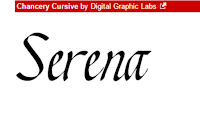
For the title, we found five different fonts which we could use for our film title. Font A to the right is a very simple font and is bold enough not to have any of the letters get lost into the background, which happens with thin fonts. The downside of this font is that it is too simple and uninteresting and isn't very exciting, which if used would make people think our thriller opening boring and lack excitement.
 |
| Font B |
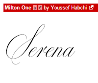
Font B to the left has a lot more character than font A. This font is much more suited to our thriller, as one of our main characters is a woman who is seen as very elegant and well-presented, which is exactly what this font portrays. However, unlike font A, font B is not bold enough and would easily be lost in editing due to its thin letters, and the effect of this font would be under-appreciated.
 |
| Font C |
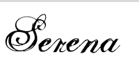
This font is quite bold and has very prominent and curly serifs. This font a quite overwhelming and over-powering. I don't think that this font would be the best one to use as it's too curly and doesn't really fit the theme of our thriller as much as the other fonts we have found
 |
| Font D |
Font D is very elegant due to the type of serif used on each letter. The benefit of this font is that it's not too thin, meaning it wont get lost in editing and you'd be able to see all of the font still. This font suits the main character - Serena - because the font is elegant and sophisticated, just like how Serena is. The audience will quickly figure out Serena's qualities just from seeing this font.
 |
| Font E |
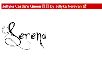
Font E has serifs, however these serifs are sharp and scratched, which defeats the fact that Serena is elegant and sophisticated - this font is scruffy and is more suited to the horror genre rather than the genre of our thriller film.
Credits and Names
 |
| Font F |
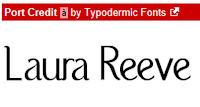
Font F is a very clear font where you can easily read the words. Also this font is quite bold so it wouldn't get lost during editing, making it a good choice of font. As well as this, it has Film Noir font conventions.
 |
| Font G |
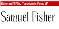
Font G is a font which is quite pleasing to the eye - it's easy to read but it's not boring, it has slight serifs making it interesting and is quite formal. This font is also good because it has a sense of formality which is a key part of Film Noir conventions.
 |
| Font H |
Font H is quite bold which is good because this means it would be easy to use in our thriller opening as none of the letters would be lost during the editing process. This font has features of a Film Noir font due to it's neat, simple qualities.
 |
| Font I |
Font I is an uninteresting font due to the lack of serifs, or anything to make it even slightly unique or exciting. This font is simply average and is not a good choice for our thriller opening due to the absence of any Film Noir font conventions.
Production Company Name

This font is the only font we found to use for our production company name, we didn't look for any more after we found this font because the whole group agreed that this font was perfect to use as our production company name font. This font is very interesting due to the serifs on the start and end letters. The font is easy to read and fairly bold, despite the thin lines of the serifs which may get lost in editing, however we didn't think this would be too much of a problem because the main body of the letters are still fairly bold. Our chosen production company name is this font as it is very pleasing to the eye and is also quite interesting.


 This font is the only font we found to use for our production company name, we didn't look for any more after we found this font because the whole group agreed that this font was perfect to use as our production company name font. This font is very interesting due to the serifs on the start and end letters. The font is easy to read and fairly bold, despite the thin lines of the serifs which may get lost in editing, however we didn't think this would be too much of a problem because the main body of the letters are still fairly bold. Our chosen production company name is this font as it is very pleasing to the eye and is also quite interesting.