Thursday, 24 March 2016
Monday, 7 March 2016
Wednesday, 24 February 2016
Choosing Fonts
Title
For the title, we found five different fonts which we could use for our film title. Font A to the right is a very simple font and is bold enough not to have any of the letters get lost into the background, which happens with thin fonts. The downside of this font is that it is too simple and uninteresting and isn't very exciting, which if used would make people think our thriller opening boring and lack excitement.
Font B to the left has a lot more character than font A. This font is much more suited to our thriller, as one of our main characters is a woman who is seen as very elegant and well-presented, which is exactly what this font portrays. However, unlike font A, font B is not bold enough and would easily be lost in editing due to its thin letters, and the effect of this font would be under-appreciated.
This font is quite bold and has very prominent and curly serifs. This font a quite overwhelming and over-powering. I don't think that this font would be the best one to use as it's too curly and doesn't really fit the theme of our thriller as much as the other fonts we have found
Font D is very elegant due to the type of serif used on each letter. The benefit of this font is that it's not too thin, meaning it wont get lost in editing and you'd be able to see all of the font still. This font suits the main character - Serena - because the font is elegant and sophisticated, just like how Serena is. The audience will quickly figure out Serena's qualities just from seeing this font.
Font E has serifs, however these serifs are sharp and scratched, which defeats the fact that Serena is elegant and sophisticated - this font is scruffy and is more suited to the horror genre rather than the genre of our thriller film.
Credits and Names
Font F is a very clear font where you can easily read the words. Also this font is quite bold so it wouldn't get lost during editing, making it a good choice of font. As well as this, it has Film Noir font conventions.
Font G is a font which is quite pleasing to the eye - it's easy to read but it's not boring, it has slight serifs making it interesting and is quite formal. This font is also good because it has a sense of formality which is a key part of Film Noir conventions.
Font H is quite bold which is good because this means it would be easy to use in our thriller opening as none of the letters would be lost during the editing process. This font has features of a Film Noir font due to it's neat, simple qualities.
Font I is an uninteresting font due to the lack of serifs, or anything to make it even slightly unique or exciting. This font is simply average and is not a good choice for our thriller opening due to the absence of any Film Noir font conventions.
Production Company Name
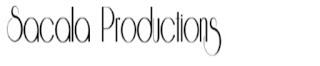 This font is the only font we found to use for our production company name, we didn't look for any more after we found this font because the whole group agreed that this font was perfect to use as our production company name font. This font is very interesting due to the serifs on the start and end letters. The font is easy to read and fairly bold, despite the thin lines of the serifs which may get lost in editing, however we didn't think this would be too much of a problem because the main body of the letters are still fairly bold. Our chosen production company name is this font as it is very pleasing to the eye and is also quite interesting.
 |
| Font A |
 |
| Font B |
Font B to the left has a lot more character than font A. This font is much more suited to our thriller, as one of our main characters is a woman who is seen as very elegant and well-presented, which is exactly what this font portrays. However, unlike font A, font B is not bold enough and would easily be lost in editing due to its thin letters, and the effect of this font would be under-appreciated.
 |
| Font C |
This font is quite bold and has very prominent and curly serifs. This font a quite overwhelming and over-powering. I don't think that this font would be the best one to use as it's too curly and doesn't really fit the theme of our thriller as much as the other fonts we have found
 |
| Font D |
Font D is very elegant due to the type of serif used on each letter. The benefit of this font is that it's not too thin, meaning it wont get lost in editing and you'd be able to see all of the font still. This font suits the main character - Serena - because the font is elegant and sophisticated, just like how Serena is. The audience will quickly figure out Serena's qualities just from seeing this font.
 |
| Font E |
Credits and Names
 |
| Font F |
Font F is a very clear font where you can easily read the words. Also this font is quite bold so it wouldn't get lost during editing, making it a good choice of font. As well as this, it has Film Noir font conventions.
 |
| Font G |
 |
| Font H |
Font H is quite bold which is good because this means it would be easy to use in our thriller opening as none of the letters would be lost during the editing process. This font has features of a Film Noir font due to it's neat, simple qualities.
 |
| Font I |
Production Company Name
 This font is the only font we found to use for our production company name, we didn't look for any more after we found this font because the whole group agreed that this font was perfect to use as our production company name font. This font is very interesting due to the serifs on the start and end letters. The font is easy to read and fairly bold, despite the thin lines of the serifs which may get lost in editing, however we didn't think this would be too much of a problem because the main body of the letters are still fairly bold. Our chosen production company name is this font as it is very pleasing to the eye and is also quite interesting.
Thursday, 21 January 2016
Pitch/Treatment
Darkness seeps across the concrete slabs. Blunt thuds creep down the alley into the shadows. The night shrouds an unknown man, adorning a trench coat that cascades down from his shoulders. He is on the phone to a petite woman, delicately putting blood-red lipstick on her soft lips.
"Now do me a favour. Mordecai; fetch me that bag and don't get caught" she purred.
Mr. Mordecai gave a grunt and put his phone away. Precarious and cautious, the man slithered towards the monolithic house's door, unsheathing a sword-like lock pick. With a few twists and jolts, he got in. Mordecai crawled around the house and located the bag in minutes. He recovered the bag and slipped out the house like a ghost. Bright lights caught Mordecai in a daze. Slinking out of the shadows, a beautiful woman materialised. A slit of red made a tiny chuckle.
"Miss Jezebel, what should we do?" a gruff voice growled from behind the rays of the car light. Smooth Miles-Davis like jazz plays.
Influenced by "L.A Noir" and "Double Indemnity", the opening uses low-key lighting to establish characters as sinful, morally ambiguous and dangerous characters who don't follow the social norm. The costumes have been heavily influenced by the colours used in "Sin City". For example, we are planning on using a similar costume the female wore in the opening as it is red which is a seductive and powerful colour. Our location has been influenced by "The Third Man" as the house we are planning to film at is an old house with a barred staircase in order to show German Expressionism.
Influenced by "L.A Noir" and "Double Indemnity", the opening uses low-key lighting to establish characters as sinful, morally ambiguous and dangerous characters who don't follow the social norm. The costumes have been heavily influenced by the colours used in "Sin City". For example, we are planning on using a similar costume the female wore in the opening as it is red which is a seductive and powerful colour. Our location has been influenced by "The Third Man" as the house we are planning to film at is an old house with a barred staircase in order to show German Expressionism.
Wednesday, 20 January 2016
Character Planning
Main Character (1) - Mr Mordecai
Personality:
Personality:
- Nationality: English
- Age: 28
- Aspects: Determined, headstrong, brave, morally ambiguous
- Gangster.
Costume:
- Black/dull colours
- Big black coat
- Fedora
Possessions:
- Lockpick
- Phone
- Bag
He is inspired by characters from Casino Royale and La Noir.
Main Character (2) - Serena
Personality:
- Nationality: English
- Age: 18-25
- Aspects: Dangerous, seductive (femme fatale), manipulative, intelligent, strong
Costume:
- Well-dressed
- Dress/skirt
- Big heels/ heel boots
Possessions:
- Knife
- Phone
Extras - Henchmen x2
Personality:
- Nationality: English
- Age: 18-25
- Aspects: Strong, not that intelligent, quiet
Costume:
- Long black coats
- Black trousers
Possessions:
- Guns
- Knives
- Bag
Monday, 4 January 2016
Essex Boys [Unfinished]
Analysis of Stills

This shot uses a strong key light and backlight. The effect of this is that is makes us as the audience believe that this character has a significant and important role in this film. Furthermore, this shot's light is used in such way which lights up half of his face and keeps the rest in darkness, which leads us to think that this character has a good side and a bad side. As well as this, the character dominates the whole frame as he is the only thing we can see, this shows again that he is an important character and is also a very dominant one.

Again in the shot to the right, this character dominates the whole shot and is standing in a superior stance, which makes clear of his status to the audience. Moreover, another thing which establishes his status is the low angle shot looking up at him, as we see from the other character's eyes. The perspective of the other character - Billy - we see through his eyes that the windscreen of the car is very dirty which shows that Billy has a clouded view of the character before him. This could represent how Billy doesn't know what he's getting himself into as he doesn't know what Jason is really like; his vision of him is clouded.
 The significance of the tunnel's lights reflecting onto the car windscreen could foreshadow how both characters could eventually end up in prison due to what they do throughout the film. This still from the film also links to another still which could also foreshadow that prison may be in the cards for them later on in the film.
 Before they enter the tunnel, we see this shot. This shot lets us us see down the tunnel which we can see is dark towards the end; this darkness could represent how these 2 characters are heading into something dangerous and unknown. Furthermore, the tunnel is lit by lights along the top which look like prison bars, again foreshadowing that prison might be where they end up at the end of their journey.

This shot is very bleak and empty which could be representative of the lives the people in seen in this film. As well as this, the vanishing point in this shot emphasises the thought of these people's lives being bleak and empty as it could show that this bleakness is never ending and they're never going to escape it. The dull colour palette used in this shot further emphasises


This shot is very bleak and empty which could be representative of the lives the people in seen in this film. As well as this, the vanishing point in this shot emphasises the thought of these people's lives being bleak and empty as it could show that this bleakness is never ending and they're never going to escape it. The dull colour palette used in this shot further emphasises
Subscribe to:
Posts (Atom)